Canon Best in Glass
About Project
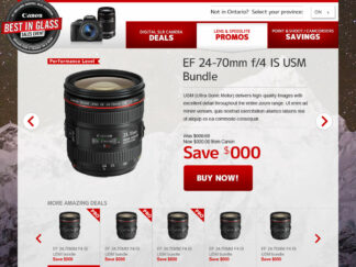
Visually, the goal of this project was to take up as much screen/browser space as possible. Although the site was just one file the client wanted each section (Deals, Promos, and Savings) to be the same height as the user's screen and scrolling with the mouse or keyboard would advance to the next or previous section. If the screen/browser window was less than 800px then the section could scroll.
Each section contained multiple items displayed as a slideshow. The slideshow had a thumbnail navigation that would always sit at the bottom of the window.
The client suggested the following 3rd part plugins and they were very helpful:
- IP2Location LITE to default the user's province. Items for sale and their Buy Now links were different based on the user's province.
- One Page Scroll to make switching sections look nice.
- Superslides for the slideshow.
© 2025 - Amanda Lutz * Web Developer

